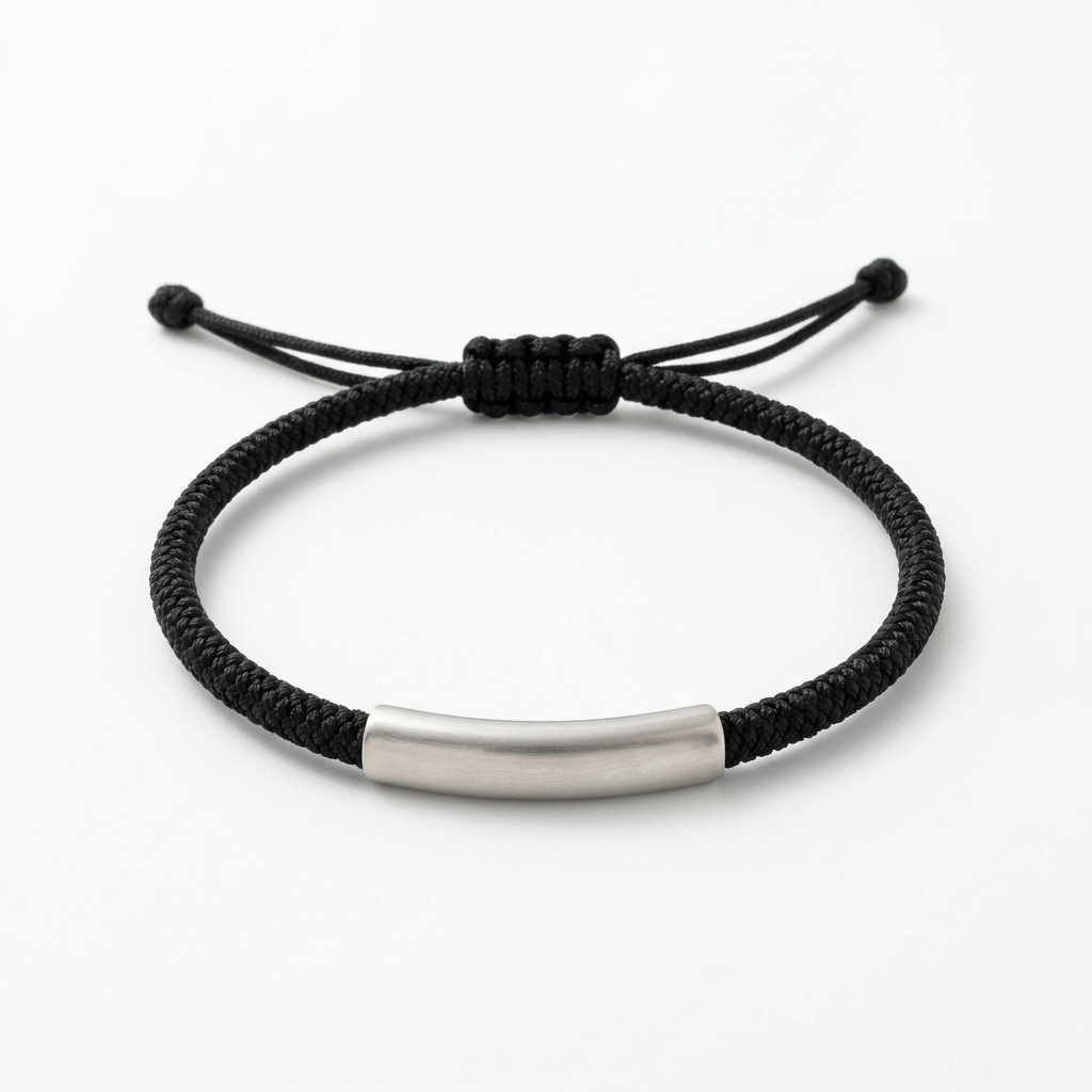
Darkline — Black Braided Cord Bracelet with a Plain Silver-Tone Curved Accent and Sliding-Knot Design for Understated Unisex Styling
Darkline — Black Braided Cord Bracelet with a Plain Silver-Tone Curved Accent and Sliding-Knot Design for Understated Unisex Styling
Couldn't load pickup availability

🧵 Darkline: Texture Does the Talking
No dangling symbol. No colored stone. No message printed across the front.
Darkline begins with black braided cord and introduces one quiet contrast: a plain silver-tone curved accent at the center. The woven-looking surface creates the texture; the pale metallic-looking detail gives the eye a place to pause.
The result is a pared-back styling direction that does not rely on sparkle or a decorative motif. It can sit beside denim, an overshirt, or a clean jacket without asking you to change the character of the outfit.
Choose the idea for its contrast: dark against light, a repeated braid beside a simpler surface, a rounded cord beside an elongated accent.
Design Note 01: Begin With the Line
The cord forms the main visual body of the bracelet. Its black color gives the outline definition, while the braided pattern prevents that outline from appearing completely flat.
Look at the white-background design image and follow the repeated diagonal-looking segments along the curve. Small changes in light reveal the pattern without needing another color woven through it.
This makes Darkline different from an open-link chain or a continuous bead strand. The interest comes from the surface rather than the space between components. From farther away, you notice a dark band. Closer up, you begin to read its texture.
The specific fiber composition has not been confirmed. Braided cord describes the intended design appearance, not a claim of leather, cotton, nylon, or another particular material.
Design Note 02: Give the Contrast a Purpose
The silver-tone center accent follows a gentle curve and appears as a plain tube-like form around the cord. It is not shown with an engraving, a stone setting, or a separate hanging attachment.
Keeping that surface simple makes its relationship with the braid more visible. The cord supplies repeated detail. The center accent supplies a calmer, broader shape.
Its elongated outline also changes the rhythm at the front of the bracelet. Instead of continuing the same texture uninterrupted, the eye encounters one contrasting section before returning to the black braid.
Silver-tone refers to the intended color only. The design is not presented as sterling silver, stainless steel, or another verified metal composition.
Design Note 03: Let the Back Belong to the Design
The reference design shows a black sliding-knot arrangement at the rear, with cord tails finished in small stopper knots. There is no lobster clasp, extension chain, or dangling metal tab in this concept.
The knot brings the same dark texture around the back rather than introducing a second metallic focal point. The two tails are part of that visual arrangement, not additional decorative charms.
The actual adjustment method, minimum and maximum circumference, and ease of operation must be confirmed on the supplied product. The image alone does not establish a fit range or support a one-size-fits-all promise.
Before selecting the final bracelet, check both the wearing circumference and the opening needed to put it on. A sliding-knot appearance is not a substitute for measured fit information.
🧥 Outfit Study: Three Ways to Use the Contrast
A light shirt, a defined outline
Try a pale blue or ivory shirt with the sleeve turned back. The lighter fabric makes the black cord easier to distinguish, while the silver-tone accent introduces a smaller point of contrast within the dark line.
Leave the wrist area relatively clear if you want the braid to remain visible. The look does not need matching accessories or a repeated metallic detail elsewhere.
Dark layers, quieter detail
With a charcoal knit or a black overshirt, the cord becomes more tonal. The center accent takes on a greater visual role because it differs more clearly from the surrounding palette.
This can be useful when you want the bracelet to feel integrated rather than immediately noticeable. The texture is still there, but it becomes something discovered up close.
Color without a colored bracelet
Rust, terracotta, moss green, and cobalt blue each give Darkline a different setting. The bracelet stays neutral while the clothing provides the color.
A moss-green shirt brings a softer, earthy direction. A cobalt sleeve creates a sharper contrast. Terracotta introduces warmth around the cool-looking center accent. You can change the mood without needing several bracelet colorways.
What to Leave Out
Sometimes the most useful styling decision is subtraction.
If a watch already creates a strong shape on one wrist, consider wearing Darkline on the other. If you want to layer it, begin with one simple companion and check that the braid and central accent remain recognizable.
A stack of several broad pieces may hide the very texture that makes this design interesting. A finer neighboring chain can offer contrast, but it is an option rather than a requirement.
The unisex styling direction is about the restrained color palette and uncomplicated shapes. It does not establish universal sizing or imply that everyone wears jewelry in the same way.
An Ordinary Day, With One Deliberate Detail
Imagine putting on your usual jeans and an overshirt before leaving for coffee. The outfit already works. Darkline simply adds a small detail that feels consistent with it rather than a separate statement.
Later, a cleaner jacket changes the context. The bracelet does not need to become dressier to remain part of the combination. Its black-and-silver-tone contrast can stay quiet while the clothing carries the larger change.
This is a styling story, not a claim of suitability for every activity. Follow the final supplied product’s care and wear guidance, especially where moisture, friction, or repeated adjustment may be involved.
A Gift Without a Script
Darkline offers a gift direction for someone who prefers texture to sparkle and plain surfaces to overt symbols. It can be considered for a friend, a partner, or your own accessory collection without attaching a predetermined message to the design.
Its name and dark palette do not indicate obsidian or another stone. No gemstone is part of this visual concept.
The collection’s packaging concept remains an ivory jewelry box with champagne-colored lining and a plain cream pouch, without visible logos. The pale presentation gives the black braid a contrasting setting. Confirm final packaging contents before purchase.
The Specification Check Comes Last, Not Never
The available imagery presents an intended design: black braided cord, a plain curved silver-tone accent, and a rear sliding-knot arrangement. Generated images do not verify the supplied item’s composition, construction, dimensions, or performance.
Confirm the cord material, accent material and finish, cord width, center-accent dimensions, adjustment range, and care requirements before purchase. No waterproof, sweatproof, hypoallergenic, precious-metal, or durability claim is made here.
Use the full white-background view to examine the complete outline and rear knot. The color scenes explore styling context rather than alternative product colors or measured sizing.
Less Decoration. A Clearer Point of View.
A dark line does not have to be an empty one.
Darkline combines a repeated braided texture with one plain silver-tone curve, giving a restrained design enough contrast to feel considered. Wear the idea with light colors, keep it tonal, or let a stronger outfit palette surround it.
Darkline Bracelet — $33.00 USD
Keep the shape simple. Let the texture stay interesting.